A “font” is a design style that is used to make letters consistently look a certain way on a screen or in print.
Deciding what fonts you’re going to use on your website can be a challenge.
I want to share some tricks and shortcuts I’ve found to make it easier.
Where to Find Good Fonts
I get most of my fonts from the free Google Fonts library or the paid Adobe Fonts library.
I recently discovered a font company called Hoefler&Co that is famous for creating fonts used by big name companies like Twitter, Coca-Cola and Apple.
They have their fonts available for use on the web if you purchase a yearly subscription.
You stand out more and give your visitors a unique experience when you use higher quality fonts that keep you from blending in with everyone else.
Choose Only 1 or 2 (Maaaybe 3) Fonts
When you start looking at thousands of fonts, it’s tempting to choose a different font for every button, link, heading and paragraph.
You don’t need that many.
Just pick one that can get someone’s attention as a heading and then another that’s easy to read for paragraphs.
A possible third font could be used for subheadings, but it’s not necessary.
Using less fonts makes your web pages load faster.
Sometimes I like to use one font for everything and make the heading text bigger and bolder so that it stands out.
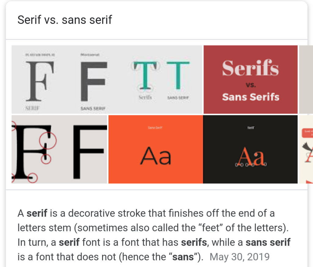
You can also choose one font from the “serif” font families and another from the “sans-serif” font families.
Need Inspiration?
If you search Google for “font pairings” you can find some good places to get ideas on what fonts go well together.
I like to use Fontjoy to generate some quick inspiration with Google Fonts.
If you come across a website that has fonts you like and you want to figure out what they’re using you can install the WhatFont Chrome extension and it will tell you the name of the font.
Or you can get a little geeky and open up the Dev Tools inspector in your web browser and look at the code.
How to Install Custom Fonts in WordPress
Your theme might already be equipped to let you choose Google Fonts through the WordPress customizer.
If not, there are plugins that can help you activate custom fonts on your site.
I’ve used the Custom Fonts plugin and the Use Any Font plugin.
There’s also the Custom Adobe Fonts plugin if you choose to go that route.
Make Your Fonts Look Good
Adjusting the color, size and spacing of your text will improve the look and feel of the fonts you chose.
If you’re using Google Fonts then I would suggest trying the Golden Ratio Typography Calculator to determine what your font size and line height dimensions should be.
I’ve noticed after using the calculator that my text looks better on the page and is easier to read.
There are also guidelines in the design world to use a dark gray color (instead of black) for your paragraph text and to put the majority of your text on light-colored backgrounds to make it easier on the eyes of your readers.
Also, don’t ever use Comic Sans.